UV Sheets Colours: Shades, Pairings and Where Each One Works
Colour is the first thing people notice about a UV board and the hardest thing to judge from a photo, because gloss changes how a shade reads under real light. This guide covers the main UV sheets colours in use in Pakistani homes, how to pair them, and how to test a shade before you commit a whole kitchen or wardrobe. See the wider UV sheets range for types and finishes.
White, cream and light grey
These are the safest UV sheets colours because they brighten a room and suit every countertop and floor. White is crisp and modern, cream is warmer and kinder in rooms with little daylight, and light grey sits between the two and hides marks better than pure white.
Pure white shows yellowing next to cream walls over time, so bring a paint swatch when choosing. A white that looks clean under shop lighting can look blue next to a warm wall.
Grey, beige and taupe
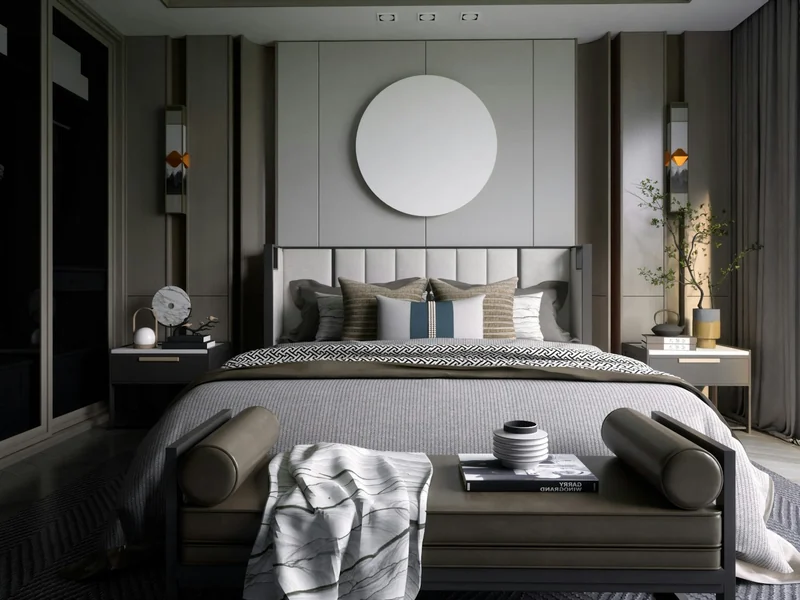
Mid tones are practical. They hide dust and fingerprints, work with both warm and cool decor and make a good base for a two-tone design. Taupe and greige have become the default for modern wardrobes because they feel calm and do not date quickly.
Wood tones
Oak, ash and walnut UV sheets add warmth next to plain colours. Light oak suits small rooms, walnut suits formal living rooms and offices, and a grey-washed wood fits modern kitchens. Mix wood with white or grey rather than using it on every surface.
Deep colours: green, blue and charcoal
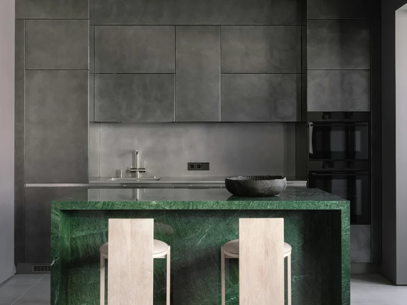
Dark UV sheets colours make a strong statement on a TV unit, a kitchen island or a single wall. Olive and bottle green are rising in popularity, navy suits both kitchens and offices, and charcoal pairs well with brass handles and wood.
Gloss intensifies deep colours, so test a full sheet first. A shade that looks refined on a sample can look heavy over a whole wall. Use deep tones for one feature and keep the rest of the room light.
Colour pairings that work
Use the table as a starting point for combining colours across doors, counters and walls.
| Main colour | Pairs with | Good in | Avoid |
|---|---|---|---|
| White | Grey, light oak, black handles | Kitchens, wardrobes | Cool white next to warm cream walls |
| Cream | Walnut, brass, beige stone | Drawing rooms, bedrooms | Cold blue-grey tiles |
| Grey | White, black, oak | Kitchens, offices | Very dark floors in small rooms |
| Green | Wood, brass, cream | Islands, TV walls | Too many other bold colours |
| Navy | White, gold, light wood | Kitchens, studies | Dark flooring and low light |
How to test a colour before you order
Look at a full sheet or a large sample at the position where it will be used, in morning and evening light. Hold it next to the floor, the wall paint and the countertop. Photograph it on your phone, then check the photo again the next day.
Gloss reflects the room, so a sheet that is blue-white under shop lights can pick up green from garden trees outside your window. Always check on site.
Does colour change the rate?
Plain white is usually the lowest rate, while metallic, deep and special colours can cost more because the coating and the print are more complex. The rate also depends on thickness and order size.
| Colour type | Size | Material only or installed | Supply area | Rate |
|---|---|---|---|---|
| White, cream, light grey | 8 x 4 ft, 18 mm | Material only | Supply across Pakistan | PKR 7,100 – 7,500 per 8×4 ft sheet |
| Wood and marble looks | 8 x 4 ft, 18 mm | Material only | Supply across Pakistan | PKR 7,500 – 15,000 per 8×4 ft sheet |
| Deep and metallic shades | 8 x 4 ft, 18 mm | Material only | Supply across Pakistan | PKR 10,000 – 15,000 per 8×4 ft sheet |
| Colour type | Size | Material only or installed | Supply area | Rate |
|---|---|---|---|---|
| White, cream, light grey | 8 x 4 ft, 18 mm | Material only | Supply across Pakistan | PKR 7,100 – 7,500 per 8×4 ft sheet |
| Wood and marble looks | 8 x 4 ft, 18 mm | Material only | Supply across Pakistan | PKR 7,500 – 15,000 per 8×4 ft sheet |
| Deep and metallic shades | 8 x 4 ft, 18 mm | Material only | Supply across Pakistan | PKR 10,000 – 15,000 per 8×4 ft sheet |
For finishes and patterns, see the UV sheet design guide and high gloss sheets.
UV Sheets Colours: Frequently Asked Questions
White, light grey and soft green are the most reliable kitchen choices. They reflect light, suit most countertops and stay current. For a bolder look, use a deep colour only on the island or lower units and keep wall units light so the room does not feel closed in.
Yes. Gloss deepens and intensifies colour and reflects the room around it, so a shade looks stronger and sometimes slightly different from a matt sample. Check a full sheet in your own room light, at different times of day, before ordering a whole kitchen or wardrobe.
Mid tones, wood grain and textured finishes hide fingerprints better than pure white or black gloss. If a surface will be touched often, choose greige, taupe or a textured oak design, and keep the clearest or darkest colours for upper doors and feature panels.
You can get close, but an exact match is hard because paint and gloss reflect light differently. Take a paint swatch to compare against a full sheet in daylight, and choose a UV shade that complements rather than copies the wall colour.
Dark gloss shows dust and fingerprints more than light tones, so it needs frequent wiping with a soft cloth. A dark semi-matt or textured version is much easier to live with. Use dark gloss on display surfaces and a lighter or textured finish where hands touch.
Send a photo or the shade name on WhatsApp, along with the thickness, the area and the quantity. We confirm availability, the matching edge band and the written rate. Ordering all sheets for one job together keeps the colour consistent across batches.
Need a colour matched?
Send a photo or a shade name. We confirm availability and quote it.